Service Businesses – 7 Deadly Web Design Mistakes That Will Kill Your Lead Generation
Probably the number one question I receive from service business owners is "how can I get more leads?"
They're often in a bit of a quandary over whether to invest in print or radio advertising, maybe get some flyers into letterboxes, pop into some networking meetings, etc.
Why are they thinking of returning to these offline forms of marketing? Because, they tell me, that they've tried Google ads and Facebook ads and Linkedin posts and other digital marketing tactics, and it's not working like it should. They're not getting enough leads.
Hmmm.
The first reason why there may be a lack of leads
The first thing I do is take a look at their website and behind the scenes in their Google Analytics account. I need to see the full story.
If they're not getting much traffic - their marketing is missing the mark in terms of audience and message. If they are getting good traffic, then the website is the problem.
The number of businesses with an online presence is increasing rapidly, minute by minute. To date, there are more than a billion websites, and an estimated 571 new websites are created every 60 seconds. That's a huge amount of online competition.
Your website has to stand out from the crowd, be enticing and inspire visitors to take action. Otherwise it’s nothing more than an expensive online brochure and a waste of money.
So, what makes one website more successful than another?
One thing. Conversions.
What are conversions?
Conversions are goals that you set for your website.
The ultimate conversion is an online purchase of course. The purchase could be a physical product, a digital product, or a service that you deliver after purchase (professional service, trade service, training course, travel, event, etc).
For most service businesses however, the purchase process is not conducted online. What they need are leads that they can follow up and convert into sales. Their website conversion goals are more likely to be leads, such as:
- Making an enquiry by completing a form
- Clicking your phone number to call you
- Subscribing to your newsletter or mini course
- Opting in to watch a video
- Downloading an ebook, voucher, checklist etc
- Registering for an event (webinar, seminar, exhibition, etc)
The first two “conversions” listed above are your hottest leads. These are the people who like what they’ve seen on your website and are ready to go the next step - speak to you directly and hopefully purchase.
The last four are warm leads. They like what they’ve seen on your website, but are not yet ready to commit. They want more info - so this is your chance to drip feed more info via email and build the relationship so that they contact you when they are ready to buy.
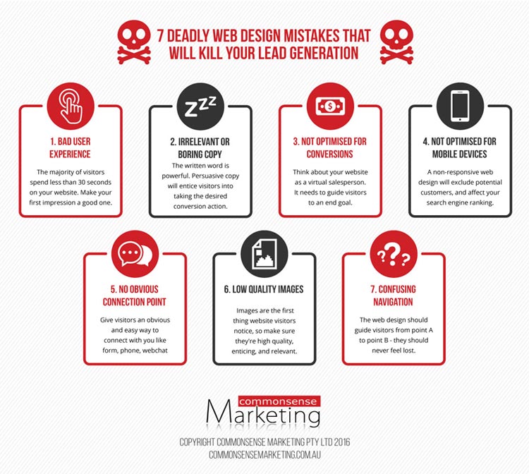
In this article, I’m going to share with you the common web design mistakes that affect conversion rates. I could have listed hundreds, but I’ve narrowed it down to the top seven.
Mistake 1: Bad user experience
Your website must provide the visitor with a great “user experience”.
What you may not realise is that 55% of visitors spend 15 seconds or less on a website. The majority of visitors won’t put in the effort to navigate a poorly designed or slow-loading website, or read words that are irrelevant to what they are looking for.
The following features are signs of ineffective web design:
- Irrelevant copy that doesn’t captivate the visitor
- Site is too slow to load (more than 6 seconds)
- Poor visual appeal - ugly or old fashioned
- Confusing or inadequate navigation
- Too much text, particularly large blocks of text
- Large image files that take ages to load
- Use of irrelevant, unappealing images
- Lots of ads
- Underlined text that looks like a hyperlink and it’s not
- No about us page - or info is sparse
- Contact info is hard to find
In fact, Google looks at a whole bunch of things like time spent on site, no of pages visited, site load speed, actions visitors take, conversions, etc and use this info as part of their complicated algorithm which determines how you’ll rank for various keywords. As far as Google is concerned - user experience is everything.
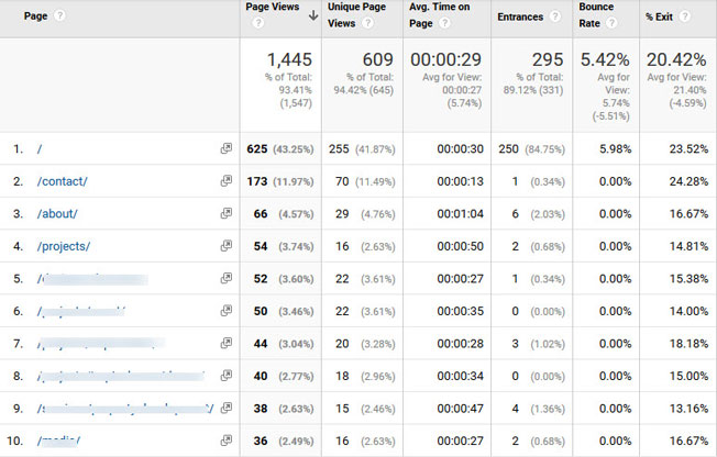
For this site, the low time spent on each page shows people are not finding the content interesting.
Mistake 2: Irrelevant or boring copy
The written word (copy) is the most powerful element of your website, so this is the one thing which must be done extremely well.
- Get to the point immediately about the benefits you bring.
- Create value for your readers by giving them all the information they will be seeking.
- Use language that is familiar and friendly.
Persuasive copy will entice visitors into taking the desired conversion actions.
Keep in mind that about 8 out of 10 website readers don’t make it past the headline. Keep copy short, focused, and to the point. Ask yourself - ‘Will my ideal customer find this page interesting, useful and compelling to the point that they will take action?’ If the answer is no, rethink it. Think like a customer.
Even if your website’s visual design is appealing, if the copy is not enticing, it will reflect in the average time on site and in the conversion rates. Here are some tips for creating killer copy:
- Relate to them and their needs.
- Build empathy by highlighting their pain points.
- Answer their concerns and questions.
- Add proof to reaffirm your claims.
- Personalize your content with story telling, so that it doesn’t sound robotic.
- Provide a guarantee to reduce their risk.
- Use sub headlines and bullet points to make it visually appealing and easy to read.
Mistake 3: Not optimised for conversions
70% of people who land on a website never come back. And, 96% of website visitors are not yet ready to buy.
So if your site has enticing copy and is well designed, then the next thing to focus on to generate leads or build your list of prospects, is to optimise your site for conversions.
Each page of your website should have one main conversion goal. Then, with that goal in mind, each page should be optimised in a way that guides visitors toward the desired action.
Features of a well-designed, conversion optimised website include:
A Call to Action (CTA) on every page. These can be different on each page - and should relate to the topic of that page.
- CTA buttons that are clearly visible - a bright contrasting colour is best, so readers know where to take action.
- A compelling label on your CTA button. Use action verbs, and give visitors a convincing reason to sign up.
- Signup forms that are short and only ask for the necessary information for the next stage. This will improve opt-in rates.
- A lead magnet which provides value which they need to optin to receive. This could be an ebook, whitepaper, checklist, video or coupon.
Mistake 4: Not optimised for mobile devices
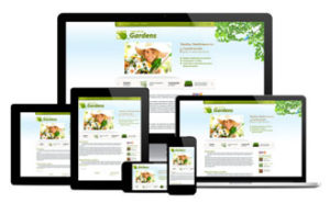
Because of this, the Google algorithm that determines how websites rank in search results penalises websites that are not mobile-friendly.
A responsive website is one that has been technically coded to automatically detect the visitor’s device, screen size, and orientation, and adjusts the layout accordingly.
Here are some important elements to consider when designing a mobile-optimised website:
- Easy to navigate
- Optimised for conversions
- Fast loading time
- Optimised font and button sizes. As reported by Hootsuite, text should be at least 14 pixels.
- Large and prominent CTA buttons
- Avoid the need to zoom
Mistake 5: No connection point
This mistake relates to not providing an obvious way for people to connect with you while they’re on your website. For example, a well-located contact form, a phone number and webchat offer visitors multiple ways to connect.
As an added bonus, connection points can give you valuable insight into visitors’ problems, pain points and desires. You can use this data to improve the content on your website, and improve conversions.
Mistake 6: Low quality images
High quality images play an important role in attracting attention. Images are the first things people notice, so are essential to creating visual appeal. Plus, quality images will increase the chance of your content being shared on social media.
When it comes to selecting images, the first choice is to use your own.
You can also find good quality, free images from photo sites such as Unsplash and Pixabay, or purchase stock images from sites like Deposit Photos, 123rf, Shutterstock, etc. We suggest choosing images which not have been used to death on hundreds of websites. The Tineye app is a great tool for checking this.
Here’s how to use images effectively on your website:
- Use images that illustrate the copy around it.
- Avoid only using images which show your vehicles or building. Whilst these are good to demonstrate your size or credibility, they are only really of interest to you. Action shots are way more interesting.
- Every one of your own images should tell a story - so add a caption to explain what it is.
- Choose engaging photos that will inspire social sharing.
- Optimise images for the web - ensure they load quickly.
- Optimise images for SEO.
Mistake 7: Confusing navigation
Last week I visited my local supermarket looking for maple syrup. I figure that it’s a spread, so I went looking for it where the honey and jams are kept. Nope. Okay, so I thought maybe it’s classified a health food - so I went four aisles across to that section. Nope. I looked on the little list thing they have at the end of each aisle - but it wasn’t listed. I walked around looking for a staff member but couldn’t find one. So I had no choice but to trawl every single food aisle till I found it, tucked away in the sugar section. Really - sugar? This made no sense to me. I was also very frustrated that I had wasted so much time trying to find this. Why don’t they have an electronic menu you can access?
The same logic goes for your website. The navigation should guide visitors from point A to point B - they should never feel lost. Instead, they should be able to find what they are looking for in several ways.
-
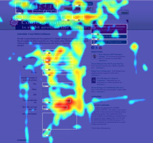
Heatmaps show you where people hover and click, and where they don't.
A well constructed, logical navigation bar is essential, and should be repeated in the footer.
- Including a search function is also useful, not only for visitors to find what they’re looking for, but to give you valuable keyword search insights in your Google Analytics.
- Special offers should be highlighted on your home page, in your sidebar and be accessible from your navigation.
- Adding in-text links on every page is a great way for visitors to find related content on other pages or posts.
Heat maps can help you understand how users engage with your content. You can use this data to see what people are clicking on and what they are avoiding, and then rearrange your content to place the most important features where people can find them. Heatmaps are a wonderful tool to use to try split testing different layouts to see which ultimately improves conversion rates.
Takeaways
As you can see there’s a lot more to developing and maintaining a high converting website than you may have originally thought. Although many websites are well designed technically, often they don’t generate sufficient leads because they’ve been created by graphic designers or web developers who don’t have in-depth marketing experience.
If you want a website that is more than an online brochure, then you need to ensure it is designed and managed by a company with experience in all aspects of online marketing.


 A Call to Action (CTA) on every page. These can be different on each page - and should relate to the topic of that page.
Hi Annette
I really enjoyed reading this article. I am a new business owner and I will definitely use your tips to help me make my website as appealing as it can be. Thank you
Lisa
Thank you for the feedback Lisa. So glad you found it useful 🙂 If you need any help, please don’t hesitate to contact us
Cheers