Why do You Need Landing Pages?
If you already have a website, then why on earth would you need a landing page – or indeed several landing pages? It’s a question we are often asked.
What exactly is a landing page?
A landing page is a kind of “stand alone” page on your website. It doesn’t have navigation to the rest of your website, so visitors who arrive at your landing page are not distracted to go and look at other pages or posts. They are forced to view the info on your landing page and either take action or leave.
When to use landing pages
Landing pages are used when we have ONE goal in mind, such as
- Get optins to your email list
- Generate enquiries
- Get registrations for an event
- Sell a product
When people take the action which leads to the goal, it’s classed as a conversion.
When you put together a marketing campaign to achieve your goal, and spend time and money driving people to your website, you want as many conversions as possible. If people arrive on your website and see all kinds of other things they can check out – then your conversion rate will diminish, because they get distracted. Every link is a distraction – and the number of links correlates to Attention Ratio.
Attention Ratio is the ratio of the number of things they can do on a given page, to the number of things they should be doing. When talking about marketing campaigns, you should only have a single goal (or you’re doing it wrong), and thus the Attention Ratio should be 1:1.
Home page / landing page case study
(The following case study is based on a campaign we ran to see if we could improve a client's leads and sales, however at the client's request we have changed the name and business type to protect his privacy.)
John runs a garden care business, and he knows that once people try out him out, a high percentage of people sign on for a monthly service, because they are delighted with how good their garden looks and relieved they don’t have to spend their weekends doing it. The hard part is getting them to try him out.
To generate leads, John was running ad campaigns in Facebook and Google Adwords which were costing quite a bit each month. He was getting good traffic to his website, but not a lot of enquiries.
On his home page he had a small promo for a discount offer which links to a popup form where people can download a coupon to get 25% off to trial his service. This was where the ads were linked to.
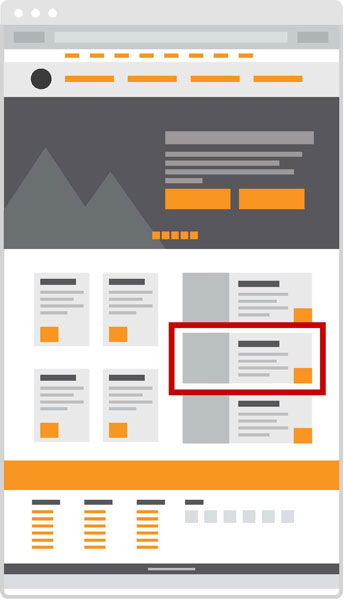
The wireframe image below left shows a typical home page design, and the position of the discount trial promotion in red. The promotion button is one of 39 links/buttons on the home page, meaning it has an attention ratio of 39:1. So there are 39 actions that visitors can take on the home page.
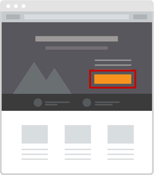
The wireframe image below right shows the one of several typical layouts of landing pages. A landing page is dedicated to the special offer, where there is only one call to action to download the coupon, giving it the attention ratio of 1:1. There’s no navigation, no other distractions – just the promo about the trial gardening service, a little bit about the client and services, two testimonials, and a big "hard to miss" call to action button to download the discount coupon.

Home page with orange promotional coupon optin button competing with all other orange buttons and links.

Landing page with orange coupon optin button – the only action available on this page.
When attention ratio goes down, conversions go up. By 35% in this case.
We tweaked the Google Ads and the Facebook Ads to focus on the special offer, and linked them directly to the landing page. Once people had downloaded the coupon, they were redirected to a friendly thankyou page with instructions on how to book in their trial gardening service. This page also had all the normal navigation links and included summaries of popular blogposts – to keep the visitors on the site and showcase John’s work and expertise in garden maintenance.
They also received further automated follow up emails with valuable tips, testimonials and other helpful information to build trust, provide value, promote sales and referral business and keep John’s brand top of mind.
Landing page design tips
Landing pages are an excellent way to build your email list, however there are a few rules to follow when designing layout and content.
- The call to action button should be in stark contrast to the rest of the page
- The headline should contain an obvious benefit so visitors can immediately see what’s in it for them
- If possible include social proof – ie: at least one strong testimonial
- Minimise the amount of information you collect in the form
- Keep the page fairly short and focused on the visitor and the goal
Measuring results
No-one, not one person on this planet, knows whether a landing page design will work or not. The only way to find out is to test it.
The easiest and fastest way to do this is to create different variants of your landing page, where you change one element per variant (headline, button, offer, etc) so you know which particular change increased conversions.
Using a landing page app like Unbounce (which is what we use) makes it easy to create landing pages and super easy to run split tests of variations to the design and content.
Want help creating landing pages?
We’ve helped many of our clients create eye-catching landing pages to generate leads, sell products, promote events or to simply build their email list. If you’d like to try out a landing page campaign in your business, simply contact us by email or phone, or schedule a chat.
Why not try out a landing page for your next campaign and compare the conversion rate with that achieved on a standard page on your website? You may just achieve more than ever before.
Photo Credits:
Aircraft: kuhnmi


